
ASP frontend developer Giulia Broli (pictured below) on the importance of making sure your event website is accessible for everyone
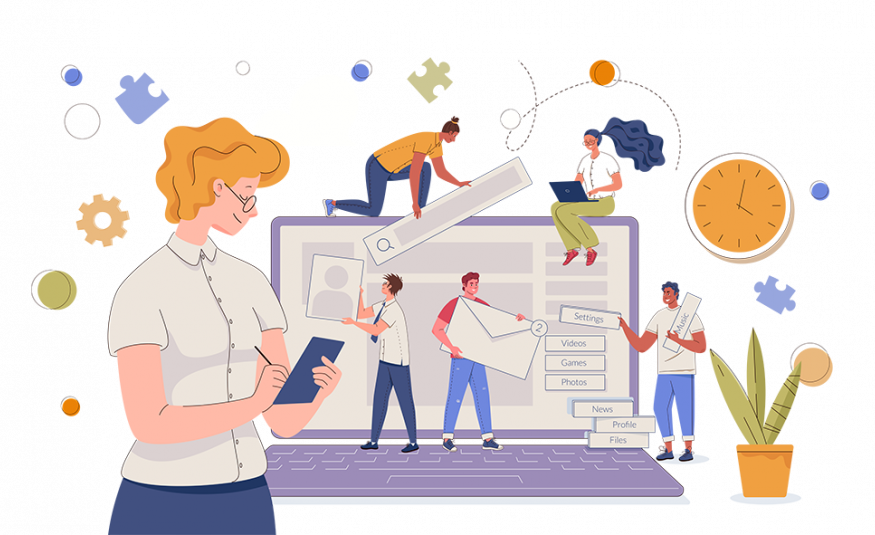
 When creating an event website, it is easy to focus on what it looks like, the UX and SEO. But how many of us stop and think about our event website’s accessibility?
Website accessibility means websites are designed and developed so that people, no matter their mobility, can use them.
Accessibility is not just about disabilities. Anyone can benefit from good accessibility. A setting that helps somebody with poor vision can also help somebody with tired eyes. An example of this is zooming into a page so you can read text more clearly.
However, currently many websites both in and out of the events industry are developed without a thought for accessibility. This means that instead of those event websites being year-round shop windows for a show, for people who need accessibility tools those shop windows are boarded up permanently.
The upshot of this is that those people who are unable to use your event website won’t be able to register to your event and worse still, may feel forgotten about or even shunned.
So how can you improve your event website’s accessibility? Below are five ways you can make quick improvements.
Provide alt text for images and other non-text content
All images and other non-text content like graphs etc. on your website should have a text alternative available. This should be descriptive text so someone using a text reader understands what is being depicted on screen.
Use closed captions and provide video transcripts
Closed captions are text alternatives for video content - essentially subtitles for a website. Both closed captions and transcripts are vital to the accessibility of media and multimedia, like videos.
Make sure your event website is readable when zoomed in
Carry out a simple check to your event website by zooming in by 150% and see if it still works without assistive technology. It is also important that zooming in doesn’t cause other accessibility issues.
Ensure there is sufficient colour contrast
For digital accessibility, colour contrast is critical. Colour contrast refers to the difference in light between any element on the website, i.e. the font and its background.
Visitors to your event website who have low vision, low-contrast vision, colour vision deficiency or frankly even people with 20:20 vision, will really benefit from content that has pronounced colour contrast.
It’s worth remembering that most people with colour vision deficiency have difficulty distinguishing between shades of red, yellow and green. This is known as ‘red-green’ colour vision deficiency. It’s a common problem that affects around 1 in 12 men and 1 in 200 women.
Make sure your event website is keyboard-friendly
Many people can’t use a mouse or prefer not to use one so instead use a keyboard, keyboard emulator, or other alternative mouse-free devices. That’s why it’s essential that every link and feature that can be operated with a mouse is accessible using only a keyboard. Testing to see if your event website is keyboard friendly is easy.
Try out some common commands like holding down Shift and Tab to see if you can move freely through your website’s content. If they don’t, speak to ASP or your website developer for assistance.
For more information on Accessibility, check out The Web Accessibility Initiative’s Web Content Accessibility Guidelines. https://www.w3.org/WAI/standards-guidelines/wcag/
Contact ASP: team@asp.events


